WordPress.com has a few too many restrictions – I’ve moved all my posts over to a Jekyll platform at http://matthewlincoln.net
Featured post
Moving to matthewlincoln.net
Leave a reply

WordPress.com has a few too many restrictions – I’ve moved all my posts over to a Jekyll platform at http://matthewlincoln.net
I will be presenting this paper the Sixteenth Century Society Conference in San Juan on October 24, 2013:

Pomegranate, Worm, and Peach, from the “Mira calligraphiae monumenta” by Joris Hoefnagel, illuminator; and Georg Bocskay, scribe. Illumination 1591-1596, script 1561-1562. The J. Paul Getty Museum, MS. 20, FOL. 83. Image © 2013, The J. Paul Getty Trust. All rights reserved.
Occult Text and Image in Georg Bocskay’s and Joris Hoefnagel’s Mira calligraphiae monumenta
The Mira calligraphiae monumenta is one of the most intriguing objects of the kusntkammer of Rudolf II. The creators of this layered work never met each other; Georg Bocskay, secretary for Ferdinand I, penned the manuscript’s calligraphic displays in 1561-2, while Joris Hoefnagel was commissioned by Rudolf three decades later to illuminate this treasure with brilliantly rendered flora and fauna. It has been argued that Hoefnagel’s additions establish a paragone between the painted image and the written word, his illusionistic naturalia surpassing Bocskay’s page-bound artificialia. It has been further argued that the outcome of this paragone reflects a Paracelsian philosophy shared by the Rudolfine court: that true knowledge can only come from natural investigation and not from secondary texts. However, this interpretation elides the complexities of magical and occult studies in Prague. The diverse schools of occult thought entertained at the Rudolfine court also included that of Heinrich Cornelius Agrippa, who believed inscribed signs had the capacity to become sigils endowed with power over the natural world. I argue that the complex formal interplay of text and image on certain pages of the MCM at times suggests that Bocskay’s scripts indeed hold sway over Hoefnagel’s natural objects. This suggests that even as Rudolf and his court appreciated the MCM for its aesthetic beauty and inventiveness, these semiotically-intelligent readers must also have related its formally-cohesive tableaus of text and nature to sixteenth-century occult notions of the physical power of the inscribed sign investigated in their own court.
In my last two posts on using Gephi to read the Getty Union List of Artist Names, I have been straightforwardly visualizing the relationships explicitly described by the dataset. This approach was a natural first step. The ULAN’s structure is artist-centric; creating a list of nodes meant reading the list from top to bottom, creating a list of edges was essentially the same task.
However it was the ULAN’s geographic information that had initially interested me. Could we usefully combine a geographic visualization with a social network visualization?
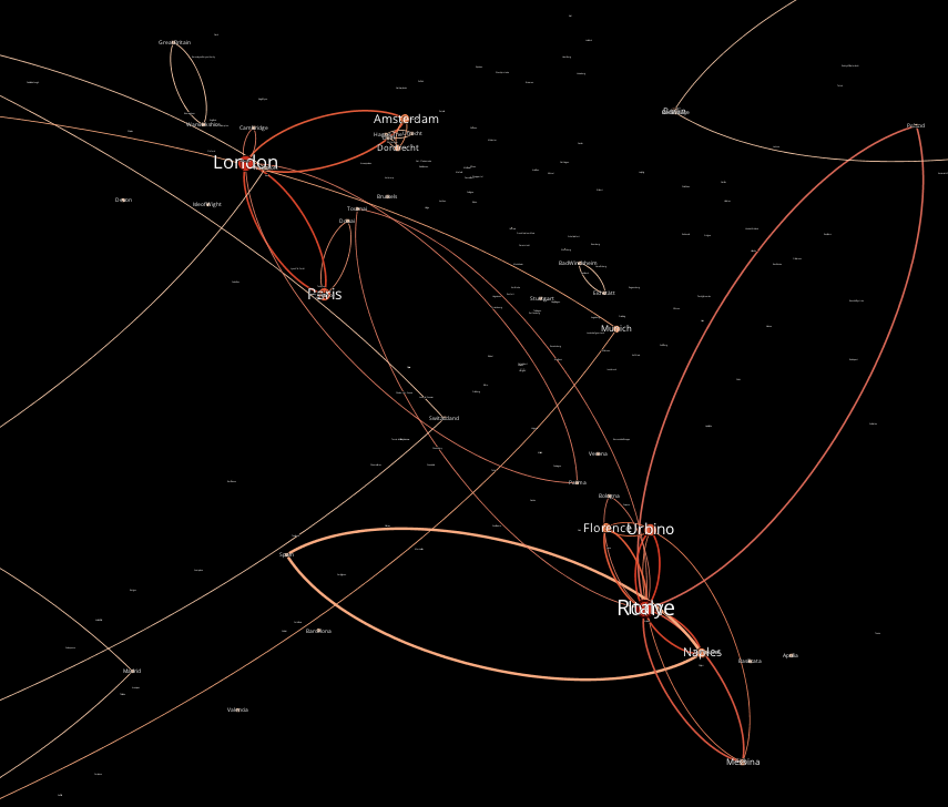
A graph of geographic locations described in the ULAN, connected by artists’ relationships. (visualization by Matthew Lincoln, underlying data © 2013 The J. Paul Getty Trust. All rights reserved.)
I rewrote my Ruby scripts to create a node list from the many geographic locations mentioned in the database, and to create an edge between cities where a relationship is described between artists inhabiting those locations.
This meant reading against the grain of the ULAN. Its hierarchy is artist-, not location-centric. While each artist entry in the ULAN has all the info you need to define an edge to another artist, this is not true when defining edges between locations. Instead of reading through the ULAN from start to end, the computer would have to skip around the data out of order, climbing up and down the XML hierarchy to find names and addresses of its artists every time it defined a new edge between nodes. To ease this process, I asked Ruby to re-copy the ULAN into a new, slimmed-down format (a series of nested hashes) that the computer could query much, much faster than slogging through the original XML file.
The resulting graph looks a bit sparse. Like my earlier graphs, this is the result of using only a tiny subset of the full ULAN. It also only represents connections between two artists who each have full geographic location, which filters out many of the entries from this subset of the database. But it offers some exciting prospects for a full-fledged geo-graph of the ULAN. Because every artist comes with life dates, we can associate every edge in the graph with a time range, which lets us easily filter our view of the graph. With some more refining, it would be possible to animate the evolving continental (or global) links between artists over the centuries, fleshing out, or even problematizing, our current narratives of artistic communication.
However I felt not a small amount of pride after putting this all together. The initial graphs are exciting and useful, but they are very literal visualizations of the ULAN – i.e., low-hanging fruit. Reading geographically, on the other hand, pushes against the structure of the original dataset. It is a testament to the folks at the Getty that the ULAN is so consistently structured that it is possible to extract a visualization like this, even when it does not follow the dominant grain of its source database.
The “flipped” or “inverted” classroom is a hot trend in higher-ed (peruse the Chronicle‘s archives to get an idea.) In brief, the instructor in a flipped classroom channels most of their content delivery (lectures, readings) outisde the classroom, often through screencasts students can watch on their own time. This frees up time in the classroom for critical discussion, questions, and student collaboration, thus taking advantage of the best part of a traditional classroom: having bodies in the room! (Or seated on ends of a log, if, like me, you prefer a Williams College analogy.)
The Michelle Smith Collaboratory has been developing resources to help our faculty and teaching assistants transition to this new format. We like to say we’re “rotating the classroom”, helping to ease our instructors gradually into a more completely flipped course.
One of my favorite tools made this spring is a series of short videos written by Molly Harrington and edited by Madeline Gent that verbally explain and visually illustrate core concepts of formal analysis in art history. Assign this series as homework for your students, so the next week you can spend the whole time evaluating and honing their skills, rather than spending class time on initial definitions.
Talking about Art: Atmospheric Perspective from TerpCollaboratory on Vimeo.
In a recent guest post on the Six Degrees of Francis Bacon project, Shawn Moore discusses the curious networks of Maria Cavendish. Moore writes:
In many ways, her networks are non-traditional in that they often exist outside of and beyond Cavendish herself…
Of significant interest is that the DNB data shows how important extra-personal (looking for a word that indicates connections beyond the intra-personal) connections are for the network Cavendish constructs, and to the networks that are constructed around the reception and reputation of “Margaret Cavendish,” thus exposing an important structure in the sociable practices at play during the period.
In other words, it seems that understanding the reception of a figure’s work through network graphs requires surveying more than the immediate neighborhood, or ego network, of figures just one edge away from Margaret Cavendish (or Rembrandt van Rijn, for that matter.) It is, of course, the relationships between these first, second, or third-level nodes that actually constitute the public conversation about the root author or artist, the conversation we are so eager to better understand.
It was after I dove into Gephi last week that I found Scott Weingart’s excellent overview of network analysis for humanitsts.1 After a cogent introduction to the basics, Weingart offers some pointed warnings to humanists about creating multimodal networks – that is, networks with different classes of nodes (e.g. artists and organizations, illustrated below.) These require their own analytical and layout tools.

A graph of the Black Mountain College network, with both artist and organization nodes. (visualization by Matthew Lincoln, underlying data © 2013 The J. Paul Getty Trust. All rights reserved.)
Although for my own purposes I am content to filter out organizations from the ULAN dataset, I also want to take advantage of the rich variations of relationships it describes. This means devising some scheme for weighting relationship types by their attribute (“master of” assigned a weight of 10, for example, while “collaborator with” gets a weight of 5).2
One would have to customize such a scheme depending on what type of influence you were interested in visualizing; interpretation and all its accompanying biases will be layered on fast and thick. I predict this will be one of the biggest hurdles to overcome as we move forward with this project.
These past few weeks I have been sorting through the data available in the Getty’s Union List of Artist Names, learning how to parse its raw XML and create tables of relevant data.
I was initially interested in the ULAN for its geographic information, hoping to use it in visualizing on a large scale the evolving connections between Netherlandish artists and the broader European, and global, community in the sixteenth and seventeenth centuries. However, I was largely disappointed by the ULAN’s sparse geographic and chronological information. Most artists have only one, maybe two entries for their active locations; for example, poor Peter Paul Rubens, a continent-skipping artist, courtier, and diplomat/spy, is attached only to Antwerp.
The ULAN does, however, richly characterize artistic, professional, and familial relationships between its many entries. After meeting with Abram this week to learn more about his social network map of Benjamin West’s studio generated using Gephi, I was inspired to try the program out on a “small” sample of the ULAN database made available for download by the Getty.

A force-directed graph generated from the association fields contained in a small sample of the Getty’s ULAN (visualization by Matthew Lincoln, underlying data © 2013 The J. Paul Getty Trust. All rights reserved.)
There’s no denying that this nicely-styled network graph is pretty. But is it useful?
In the above graph, nodes are scaled by their degree (how many immediate connections they have to other nodes) and colored by their eigenvector centrality (a measure of their relative centrality to the network at large)1 Though the array of artists in the sample data is idiosyncratic (from Raphael to Hans Hoffman), it isn’t surprising to see big names like Jacques-Louis David appear, well, big due to their well-connectedness.
However looking at color in this graph is a bit more interesting. A node (like David) important to its immediate social neighborhood does not necessarily connect as many disparate groups as a node (like David’s close neighbor Jean-Baptiste Regnault) with greater eigenvector centrality.
What does this measure tell us about artists like Regnault? How should it inform the way we define and value relationships when thinking about art historical problems? The ULAN has a comprehensive vocabulary of association types, from professional associations like “teacher of” or “apprentice of”, to familial ones like “spouse of” or “child of”. On the scale of micro-art-history, we treat these relationships individually, valuing relationships sure to communicate stylistic influence over others. At this scale, our weighting can happen on a case-by-case basis; we can generate our narratives holistically.
But when trying to measure influence from a distant perspective, looking at dozens or hundreds of artists at the same time (something uniquely suited to a digital approach), we cannot make decisions case-by-case. We must instead define rules. These may be finely-tuned filters, but nonetheless they call on us to make generalizations. When I graphed the sample ULAN data, I established a filter that would only show artistic relationships, and would cut out familial ones.

A graph of Rembrandt’s social network, including only artistic relationships. (visualization by Matthew Lincoln, underlying data © 2013 The J. Paul Getty Trust. All rights reserved.)
The corner of my graph showing Rembrandt reacted notably when I redrew the graph incorporating every type of relationship. Suddenly, Rembrandt was not only a central connector of individuals, but a connector of distinct communities that would otherwise not be attached.2

A graph of Rembrandt’s social network, including artistic, professional, and familial relationships. (visualization by Matthew Lincoln, underlying data © 2013 The J. Paul Getty Trust. All rights reserved.)
Much of this change is caused by the addition of several more nodes when I allowed Gephi to graph the full range of relationships described by the ULAN. However, note that non-artistic interconnections also appeared between nodes that had no other connections besides Rembrandt in the first iteration of my graph. In cleaning my data, I inadvertently undervalued nodes like Rembrandt that actually connected integrated communities, not just disparate individuals.
I initially thought to myself that this visualization and analysis would require a lot of preparatory planning to establish correct filtering and weighting rules. But distant looking might rather demand that the researcher iterate several visualizations, not to approach some platonic ideal visualization, but instead to generate layers to be superimposed and stitched together in a convincing narrative, much like Tim Sherratt suggested. In other words, I now wonder if this process of distant looking might have its own kind of holistic process distinct from, yet related to the close looking model.
The practice of distant looking at historical networks will need to establish its own critical methods as digital humanities fields mature (look to the folks behind Six Degrees of Francis Bacon for some deep posts on this topic.) Again and again, I think we will find that the processes of the digital humanities have much in common with the alternately-maligned-and-enshrined traditional methodologies.
Tim Sherratt’s keynote address to the Digisam conference on Open Heritage Data in the Nordic Region (entitled “A map and some pins”) is helping me cope with some of my own frustratingly messy data:
One of the things I love about being a historian is that the more we focus in on the past the more complicated it gets. People don’t always do what we expect them to, and that’s both infuriating and wonderful.
Likewise, while we often have to clean up or “normalise” cultural heritage data in order to do things with it, we should value its intrinsic messiness as a reminder that it is shot through with history. Invested with the complexities of human experience it resists our attempts at reduction, and that too is both infuriating and wonderful.
The glories of messiness challenge the extractive metaphors that often characterise our use of digital data. We’re not merely digging or mining or drilling for oil, because each journey into the data offers new possibilities – our horizons are opened, because our categories refuse to be closed. These are journeys of enrichment, interpretation and creation, not extraction.
Honthorst, the successful court painter in The Hague, had, while he still flourished as an artist, a lively brush; but, whether it was to please the girls, or because money lulled him to sleep, he fell into a stiff smoothness: about which Linschoten, who was used to attacking his work lustily, taunted him, saying that Honthorst could no longer do a worthwhile stroke. “All the same,” replied the latter, “I do better strokes than you every day of the week, and I’ll show you one you can’t repeat.” So saying, he pulled a handful of ducats from his purse, shoved them on the table, and stroked them towards him, by which he meant to show that with his painting, however it might look, he knew how to earn money, whereas Linschoten, with his broad brush, was still a poor man.
One of my favorite quotes from Samuel van Hoogstraten’s 1678 Inleyding tot de hooge schoole der schilderkonst, translation by Paul Taylor in Dutch Flower Painting 1600-1720 (New Haven: Yale University Press, 1995)
James Baker posts a familiar-sounding result from a THATCamp session on digital scholarship in the classroom.
A recent graduate of our department is exploring digital dissemination of the core discovery in his dissertation. The thought process that led him to this discovery is uniquely well-suited to a digital visualization (a hobby-horse of mine) hosted on a personal website. He is torn, however, between the imperative to market his own work and the fear of “cheapening” his scholarship through digital publication, as well as the not-totally-unjustified fear of theft.
Newly-minted humanities Ph.Ds in the paranoiac job market may be right to fear resistance or disbelief of more retardataire senior scholars. But I’d argue a good number of those same scholars can be convinced of the available grant opportunities, not to mention the wide open research possibilities in digital art history, and the benefits of open-access distribution of scholarly work.
Ross Mounce recently posted a cogent argument for uploading preprints of scholarship before they are accepted for publishing, arguing that overcoming this cultural and psychological barrier results in your work being read and cited more. (hat tip: Digital Humanities Now) Ross notes:
I suspect, like in biology, this practice isn’t yet mainstream in the Arts & Humanities – perhaps just a matter of time before this cultural shift occurs… There is one important caveat to mention with respect to posting preprints – a small minority of conservative, traditional journals will not accept articles that have been posted online prior to submission.
Some very old school scholarship: Hercules Segers, Three Books, 1615-1630 – Rijksmuseum,, Amsterdam, Bruikleen van de Rijksacademie van Beeldende Kunsten (RP-P-H-OB-867)
According to according to the SHERPA/ROMEo survey, the Art Bulletin doesn’t formally support the archiving of pre- or post-print PDFs of articles. But a better entry point for digital scholarship may be nascent open-access, online-only, peer-reviewed journals like the Journal of the Historians of Netherlandish Art. I am curious if open-access humanities journals will, in these early days, trend towards specialized fields of study staked out by already-established scholarly societies, as these societies can bring their ready-made social network of peer-reviewers. The JHNA’s online platform is incredibly basic, but its articles have been a solid mix of both new and established scholars (in other words, they seem to have broken out of the vicious cycle of prestige-chasing). Their organizational commitment having already been made, I look forward to seeing the journal jump some more technical barriers next, such as adopting some good born-digital scholarship tools like Comment Press.
Scholars can also just circumvent this whole process and directly post their work online, critics be damned. If you are interested in getting your work in front of eyeballs, Abram Fox notes the online audience for one of his papers quickly exceeded the in-person audience at its national conference presentation.
In the same vein, I’ve just uploaded three of my projects on here: a more traditional scholarly paper on Emanuel de Witte, and two digital humanities projects on mapping an artist’s diary, and getting Google Earth to recognize pre-eighteenth-century dates.
